Hello Spring
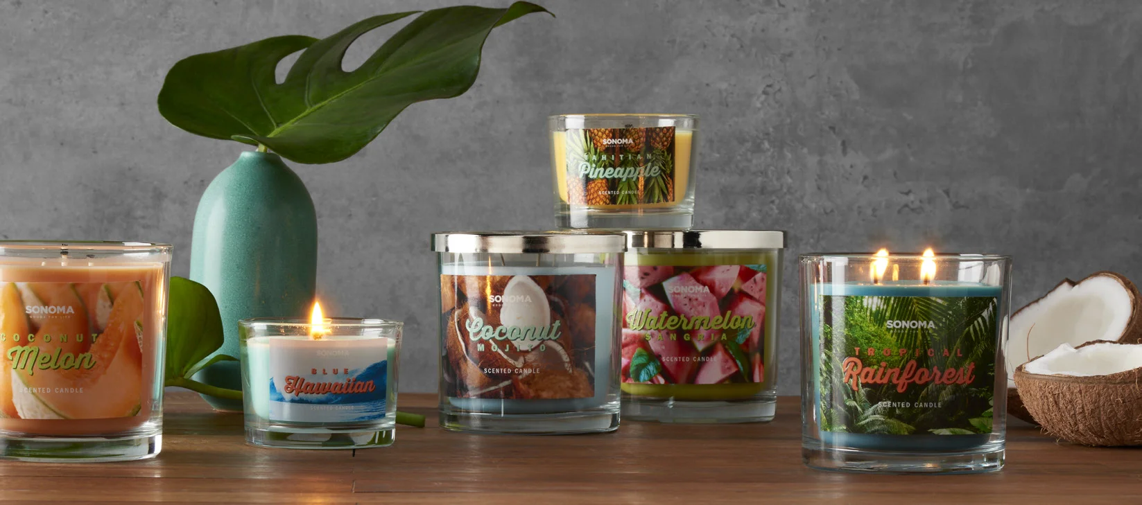
For this year’s Tropical Collection I wanted to bring fun color pops to the floor! Nothing says tropical like fun color pops and graphic type treatment, right? Each scent will take you on a tropical journey and hopefully bring a little bit of the tropics into your home! Which is nice, if you live in say…Wisconsin.
Corporation: Kohl’s | Role: Design Lead
Color Palette
The color palette is bright, vibrant, and pastel heavy. Using these 4 main color combinations allowed the collection to feel cohesive and bold.
Execution
For the imagery we sourced very graphic bright textural images. The photos were cropped in very tight to feel even more graphic. There is a raised spot UV placed on the fragrance name to give the label a 3D feel that compliments the drop shadow the let the name POP right off of the candle
Thank you as always to all of my wonderful partners that helped this collection come to life.


